
(For higher resolution versions of any of my maps please contact me)
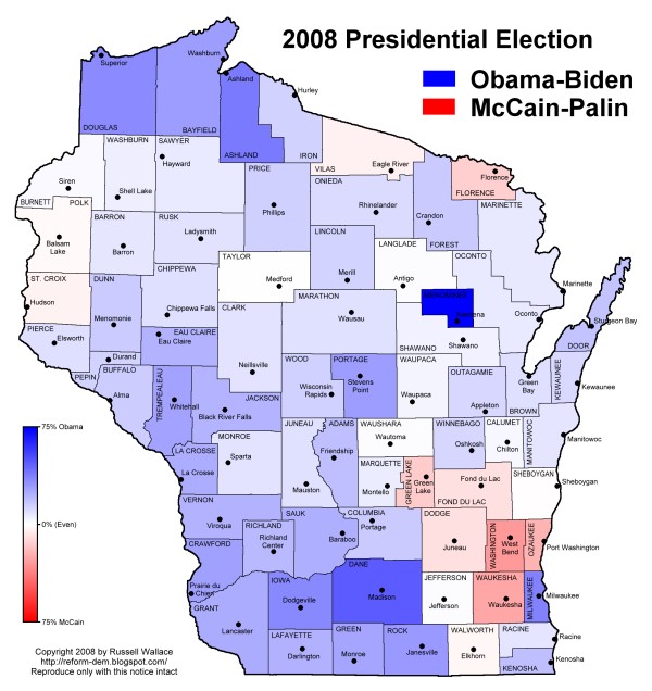
To me the most interesting thing is that although Wisconsin is far more blue than in 2004, the overall pattern is amazingly similar. Partisan identities are remarkably stable, and although swing voters may trend one way or another in any given election, the underlying demographics change quite slowly. Anyway, this will all be easier to see when I finish the maps and get the rest of them posted.
No comments:
Post a Comment